In late 2022, I was contacted to design the logo for Colorado's first professional women's ultimate frisbee team, the Colorado Alpenglow. The Alpenglow's inaugural season in the Western Ultimate League started in March of 2023.
Inspiration
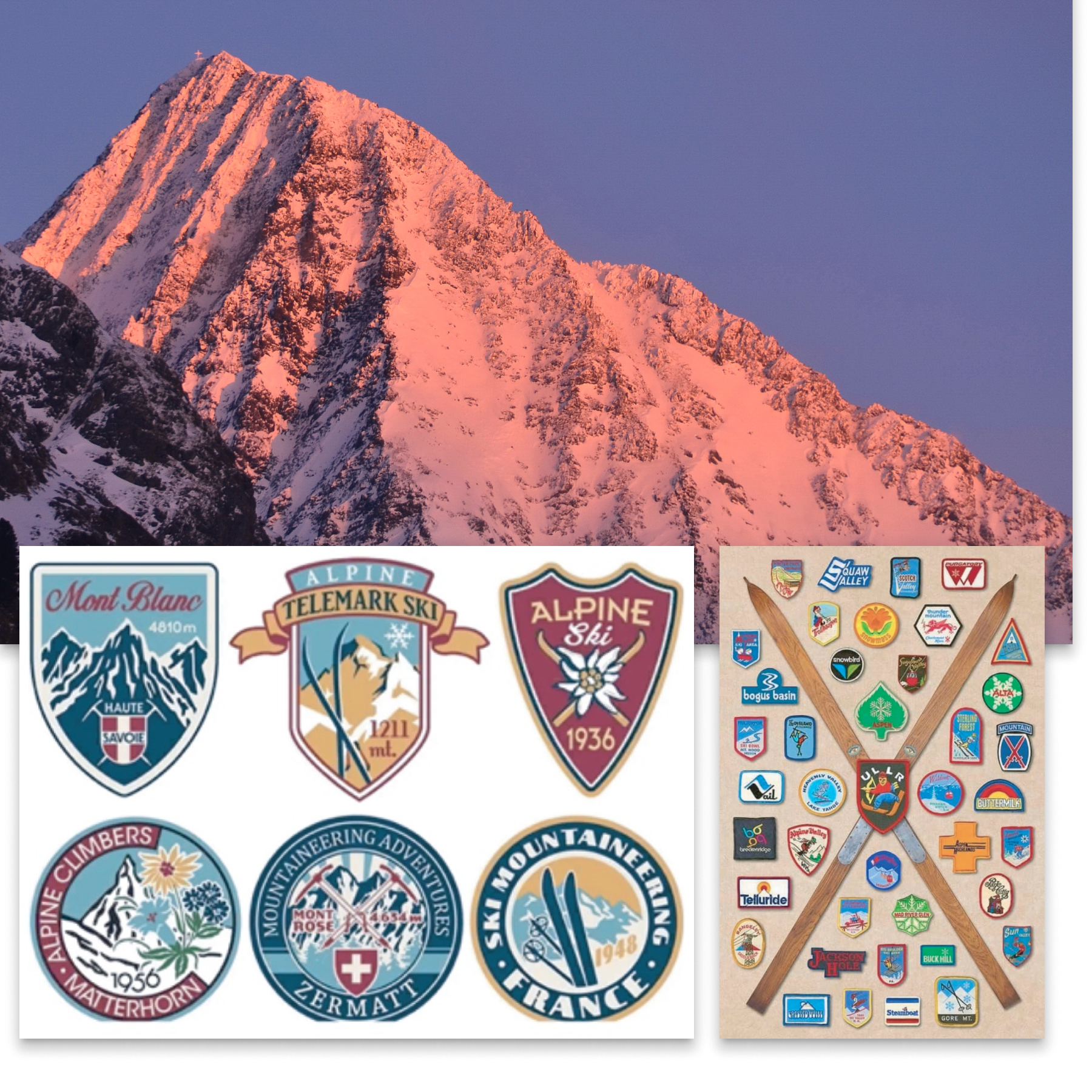
al•pen•glow: the rosy light of the setting or rising sun seen on high mountains A specific callout was made to reference vintage ski patches as the intended aesthetic direction.
Getting started
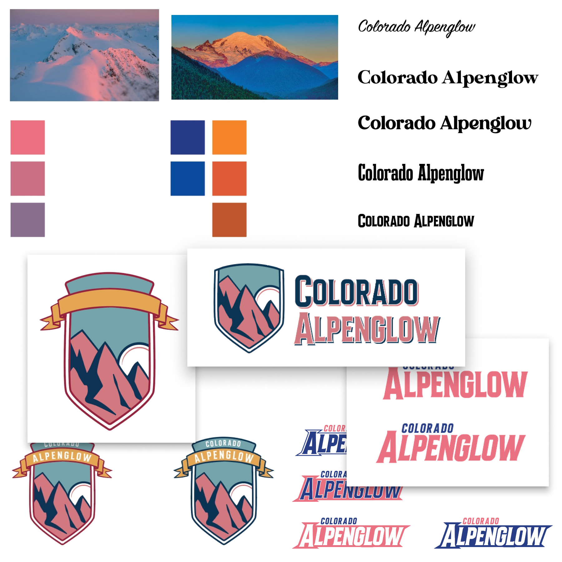
To me, this logo nearly made itself. What better color palette to work from than a beautiful mountain sunset? What a more fun artistic direction than vintage ski patches?
Getting closer
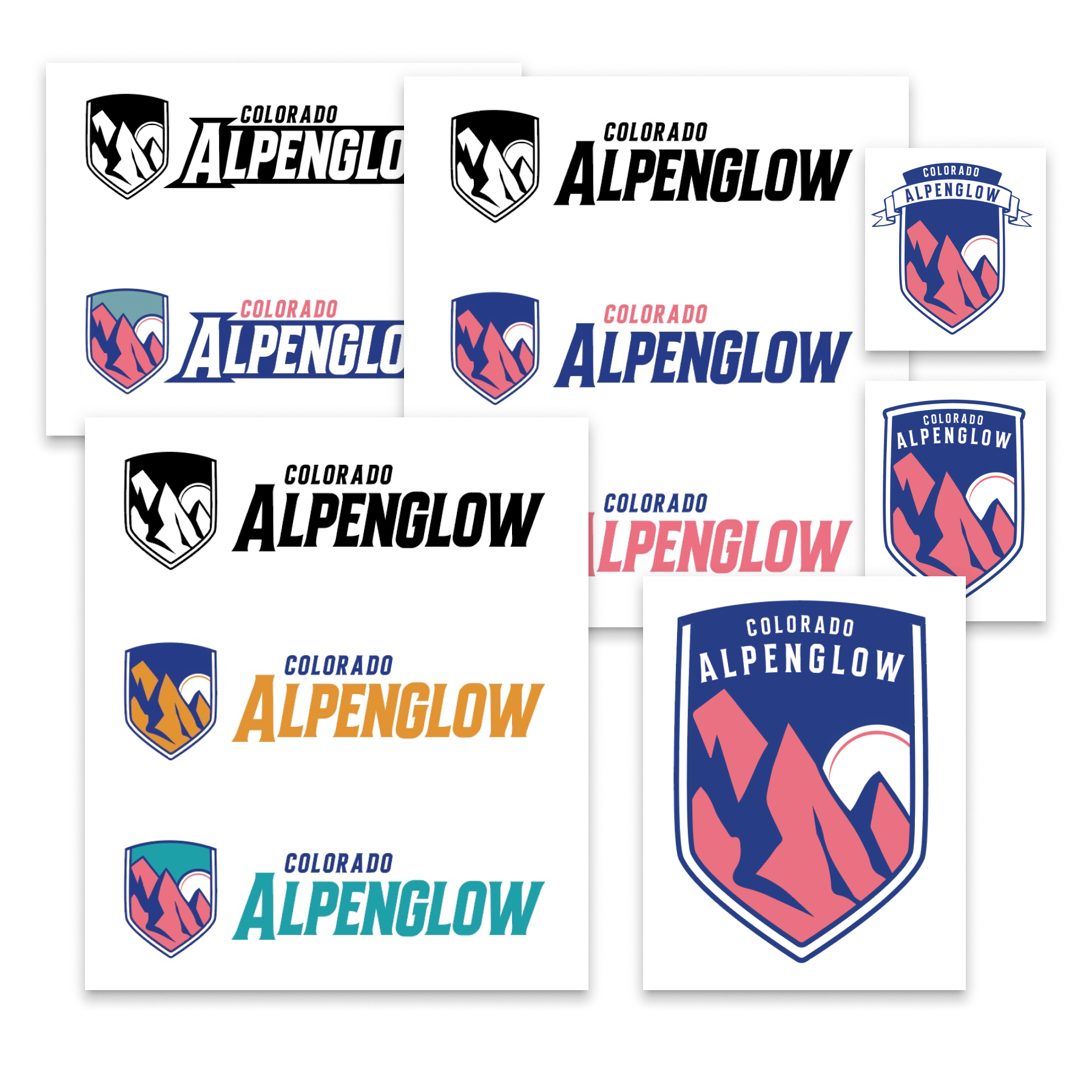
After the first few design iterations, the improvements centered around simplifying the "ski patch" as well as locking down the right wordmark.
Finished product
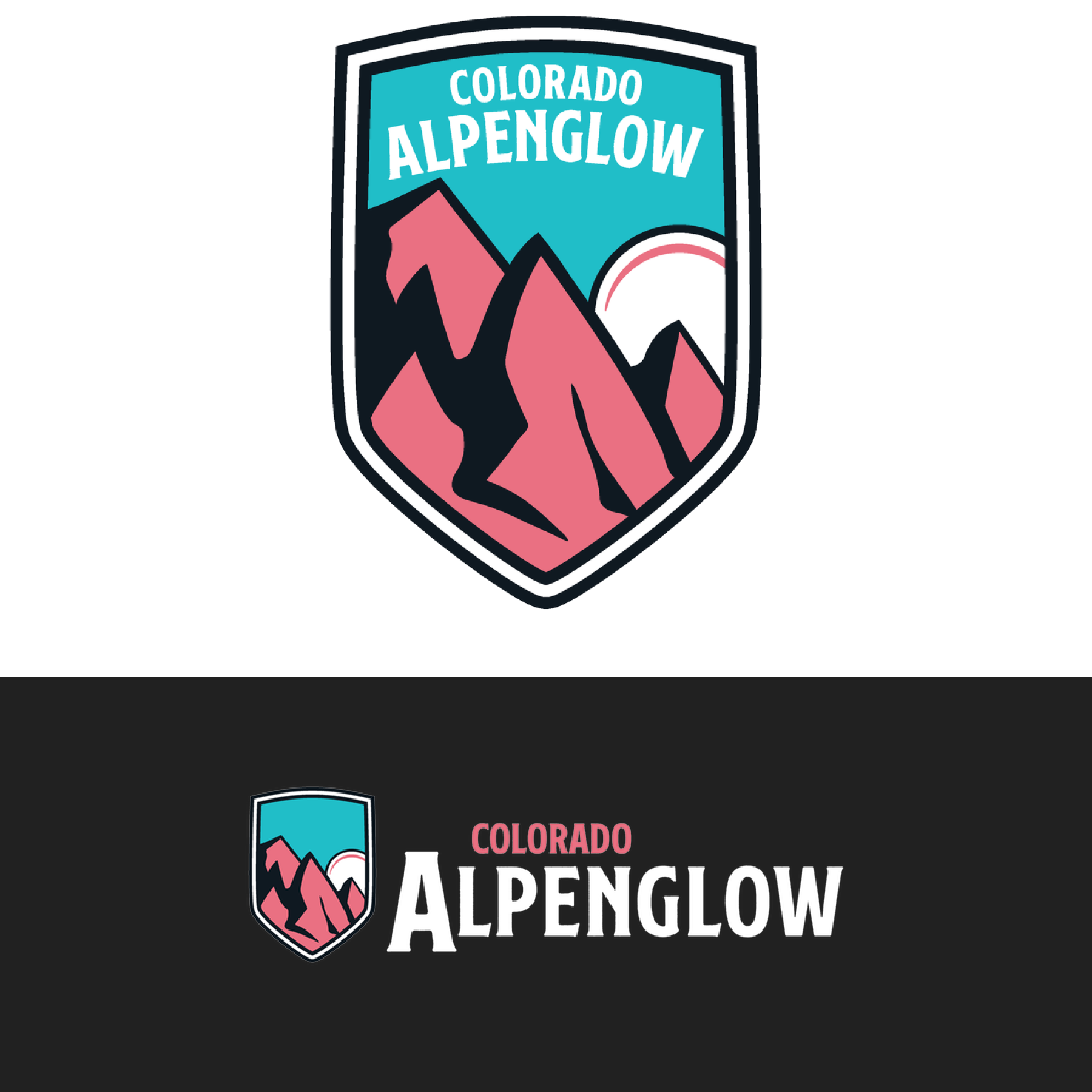
After some fine-tuning, a refined badge border, and some more type exploration later and we landed at our final design. Ultimately, the more traditional, sporty italic wordmark was not aligned with Alpenglow and WUL leadership's final vision. The typeface that we landed on was simpler, but still maintained vintage serif notes. I'm extremely happy with how this project came out. As a member of the ultimate frisbee community in Denver, I see it everywhere. It's easily one of my proudest pieces in my professional career so far.