Housecall Pro is a SaaS platform used by home service professionals to help run their small to mid-size businesses.
The problem
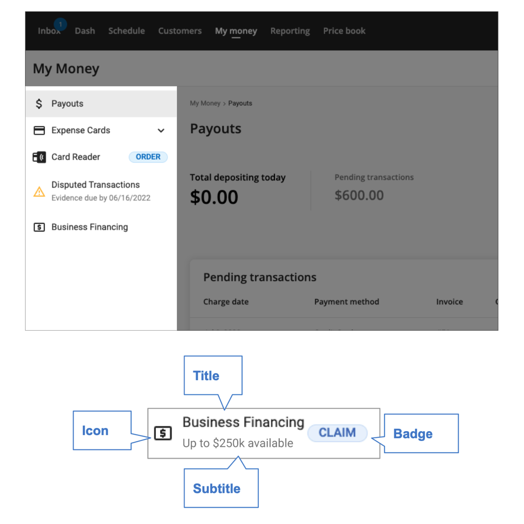
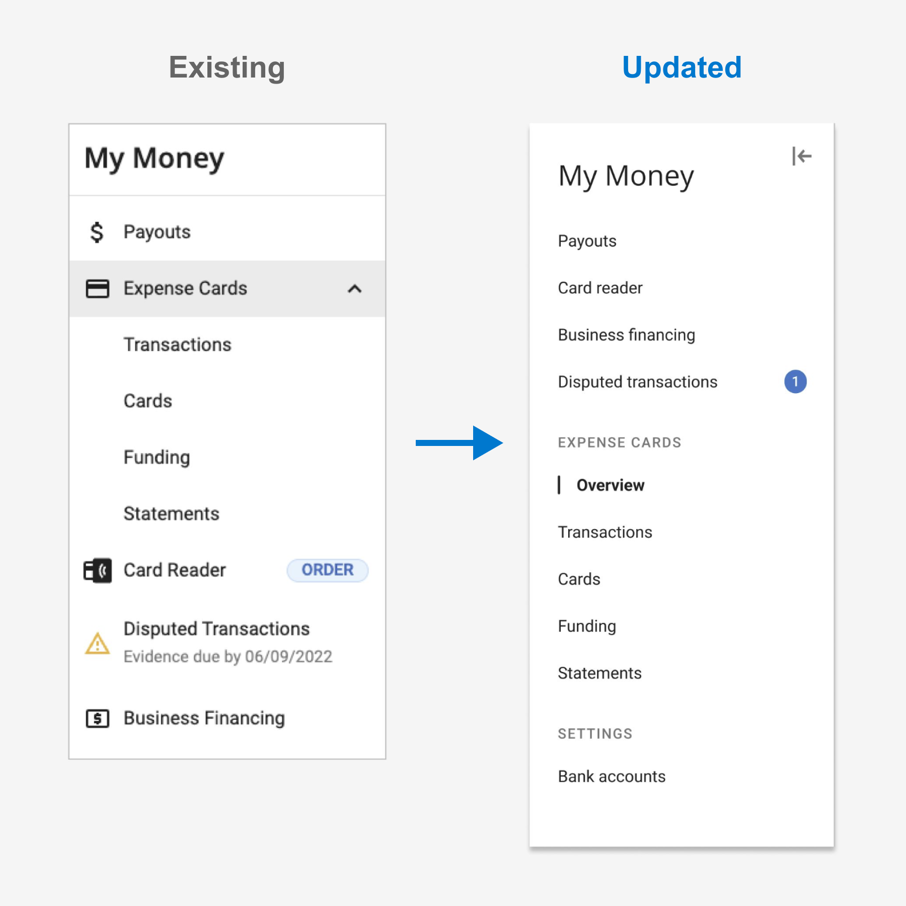
- Effective navigation should provide clarity on the user's current location and where they might accomplish their next task. The existing left-navigation (highlighted on the left) was overwhelming and ultimately, we were asking this component to do too much.
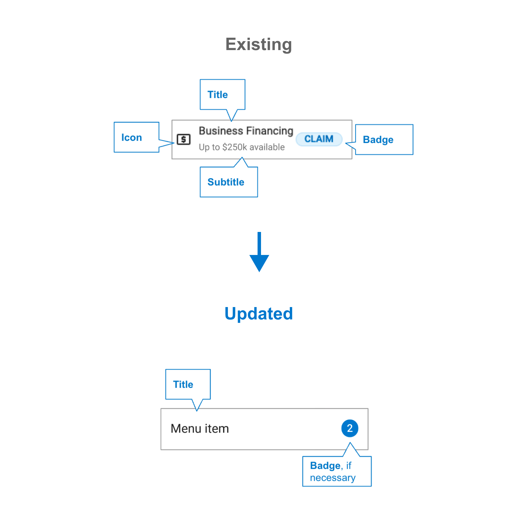
- A single navigational item could hold up to four elements: an icon, title, subtitle, and a promotional badge. The component was cluttered resulting in hindered usability.
- We heard users say things like "Where is my financing offer?" when their offer was highlighted as a badge in the navigation. Comments like these led us to believe we needed to reduce the cognitive load of this important navigational component.
- Additionally, the current navigation provided zero mobile web responsiveness.
Our goals
- Reduce cognitive load, allowing users to easily find content and complete tasks
- Prioritize consistency across the product to prevent users from having to relearn new patterns throughout the application
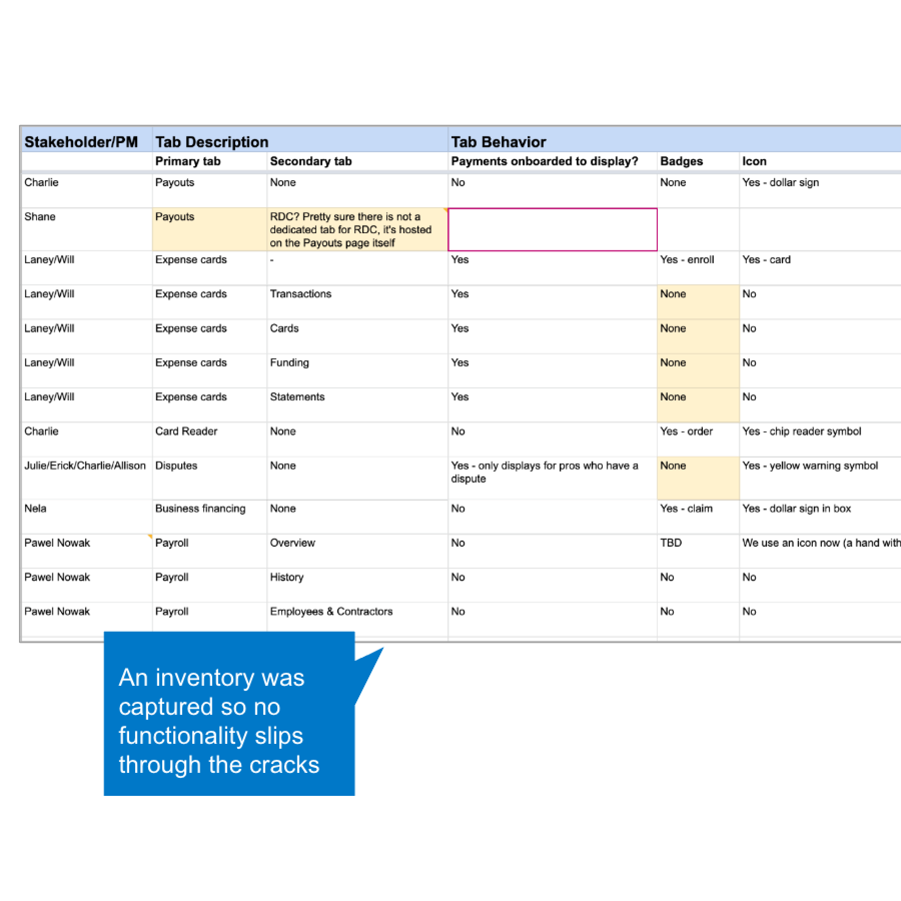
- Map out the new left-nav with one-to-one functionality of the current navigation, simplifying the work into manageable chunks for efficient implementation by the Engineering team.
What I learned
Bite-sized chunks of work: The Fintech design team often faced pushback when proposing a broad scope of revisions to the UX of the My Money section. For this project I adjusted our approach: let's focus our design vision into manageable phases. This strategy prevented the numerous Fintech squads & PMs from throwing unforeseen blockers in front of our roadmap. Cross-functional team alignment: Despite dividing the work into manageable phases, achieving cross-functional alignment posed its own set of challenges. This project demanded a thorough inventory of each feature's navigational structure and edge cases, rigorous collaboration across teams, and the presentation of a thoughtful design proposal to key stakeholders and leaders within the Fintech organization.
Mobile web considerations
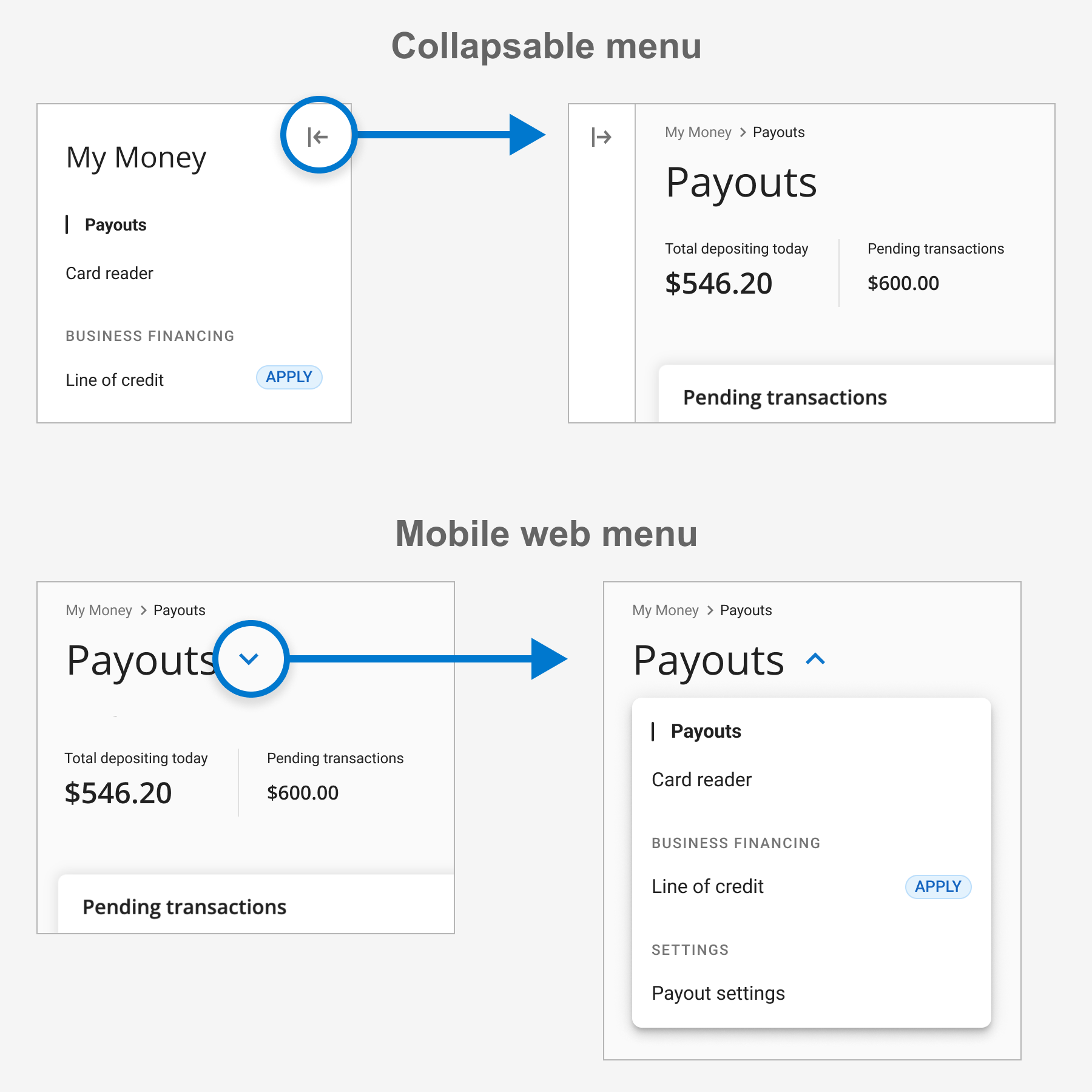
- The updated navigation component provided functionality to collapse the left navigation for medium breakpoints (600px - 900px).
- To accommodate breakpoints smaller than 600px, the left navigation simply displays the page header and a chevron. Clicking on the page header reveals the navigation menu in a dropdown style, optimizing screen real estate for the main content of the page.
The solution & results
Truly, this initiative centered around fostering collaboration and alignment between various teams. To successfully modernize the "My Money" section, the active involvement and endorsement of every team was essential. The streamlined navigation played a direct role in the increased engagement of several Fintech products. Our line of credit offering saw a months worth of applications within a single week. The Support team fielded 40% fewer requests for card readers. Ultimately, the former navigation was trying to do too much. Features were hidden and badges created a cluttered user experience. Selfishly, I was especially happy that a cherished design principle of mine, "Out of Sight, out of Mind" proved itself once again.
What my colleagues say...
"He is a quick study and is able to pick up concepts really fast. He also took a keen interest in understanding the buyer and customer persona. Allen consistently took initiative to bring forth new concepts to light and effectively participated in design reviews with the rest of the team."
Amit M. Product Manager at TrackVia, Inc.
"Allen has an excellent work ethic and his capability to move between strategy to execution is unmatched. He is always on top of industry trends and is one of the most collaborative designers I have ever seen– working easily with product and development to reach both user and business goals. On top of all that, he's a pretty great culture hire, bringing his chill and adventurous personality to every meeting."
Hannah F. Product Designer at Charter Communications
"… those slides kick ass. Kudos to you. That should make developing for those different scenarios so much easier."
Joe L. iOS Developer at Charter Communications